PowerPoint Presentations
PowerPoints help to present information in class or conference presentations and can benefit both you as the presenter and your audience. PowerPoint slides act as an outline or guide that reminds you of the information you would like to cover, in a logical order. At the same time, they give the audience something to look at and benefit visual learners who need to read information, rather than only hear it.
Slide Design
Design your PowerPoint to be simple, engaging, and easy to read with the following standards:
- Concise slide titles. Give your slides short titles (no longer than 1 line) that clearly describe the information on that specific slide.
- One topic per slide. Limit each slide to one topic. This will help with organizing your presentation and will also prevent your slides from containing too much content.
- Bullet points. Present content in bullet points, rather than complete sentences or paragraphs. Bullet points are easier to skim as you present and are less overwhelming for your audience. This text should be concise but still provide enough information to make sense on their own.
- Color with high contrast. Color/background choices should not be distracting or make information unreadable. Light-colored backgrounds should have dark text, and dark backgrounds should have light text. Be careful with backgrounds that have both light and dark colors, as text may be unreadable on certain parts of the slide. As such, generally avoid using images as backgrounds.
- Images only when needed. Include images only when they help the audience understand or visualize content. Unrelated images can be distracting and do not enhance your PowerPoint or your presentation.
Consider the following sample slides.
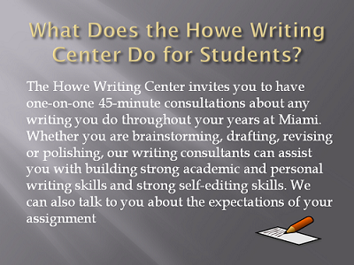
Example Slide 1 (Poor)
- Background color: Light grey and dark grey
- Slide title in gold: What Does the Howe Writing Center Do for Students?
- Slide text in white: The Howe Writing Center invites you to have one-on-one 45-minute consultations about any writing you do throughout your years at Miami. Whether you are brainstorming, drafting, revising or polishing, our writing consultants can assist you with building strong academic and personal writing skills and strong self-editing skills. We can also talk to you about the expectations of your assignment.
- Slide image: Clip-art of a pencil and piece of paper in the bottom right corner.
This first example is difficult and overwhelming to read. The slide title is longer than necessary, takes up two lines, and is difficult to read on the light grey part of the slide. Similarly, white body text is hard to read on a light grey gradient background. The content is presented in a full paragraph that fills the whole slide and is difficult to skim for the main ideas. Lastly, the image of a pencil and paper is not necessary to understand the concept of a writing center.
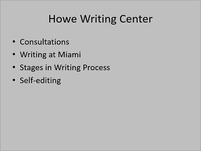
Example Slide 2 (Poor)
- Background color: Medium grey
- Slide title in black: Howe Writing Center
- Slide text in black:
- Consultations
- Writing at Miami
- Stages in Writing Process
- Self-editing
Example 2 is easier to read than Example 1, with black text on a plain medium grey background; however, not enough information is provided, and the slide is boring with unused space. The title of "Howe Writing Center" does not prepare readers for the specific aspects of the writing center to be discussed. The bullet points are easy to skim but briefly list a wide range of topics without enough details for the audience to understand them. For example, the bullet point "consultations" does not tell the audience what a writing consultation is. Rather, each topic listed on this slide should have their own slides with more detailed bullet points.
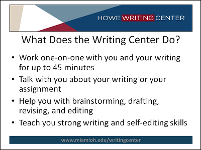
Example Slide 3 (Effective)
- Background color: White, with a color border at the top and bottom of the slide. The top border is navy, light blue, red, and white, with the Howe Writing Center logo. The bottom border is navy with the HWC website URL.
- Slide title in black: What Does the Writing Center Do?
- Slide text in black:
- Work one-on-one with you and your writing for up to 45 minutes
- Talk with you about your writing or your assignment
- Help you with brainstorming, drafting, revising, and editing
- Teach you strong writing and self-editing skills
Example 3 is the most effective in terms of slide design and content. The slide incorporates some color in a professional, custom template, but the main body of the slide is white with black text, which is the easiest to read. The slide title is descriptive and asks the same question as Example 1, but with fewer words. The bullet points provide enough information to stand on their own and are organized around one central idea for this one slide. Even still, the bullet points are concise and are not written as full sentences.
Additional Visual Aids
In addition to your PowerPoint, you can provide additional visual aids to illustrate your main ideas and keep your audience's attention:
- Handouts give your audience information to take with them or allow them to do an activity.
- Photographs let your audience see something that can be difficult to explain or imagine.
- Videos provide an example, additional explanation from a credible source, or an informational speech about your topic.
- Physical Objects let your audience see or touch something related to your topic.
Presentation Tips
- Practice and time your presentation. Practice presenting by yourself or in front of friends to become more comfortable: you will want to be familiar enough with your topic to talk outside the information on your slides. While practicing, time the length of your presentation so you do not go over your allotted time or finish too early. Set aside time for questions or discussion, if that is part of your presentation.
- Speak slowly and conversationally. Speak slowly so that your audience can understand and follow your presentation. Use simple language and a conversational tone. While spoken English is informal and allows for grammatical mistakes, avoid crutch words like "Mm," "ah," "uh," or "yeah."
- Maintain eye contact. Face your audience, rather than the board or the computer screen. It is okay to glance at your PowerPoint for content, but quickly return to talking directly to your audience. And remember to smile.
- Avoid distracting movements. Try not to fidget or rock back and forth while presenting. If you feel uncomfortable standing in one place, walk slowly to different sides of the room or different sides of your PowerPoint.