
Miami's home page upgrades to a new look
Longtimers at Miami University might remember when the Miami home page was a nondescript shade of brown and, really, who needed photography?
In the early 2000s, the website evolved slowly, including official school colors and more photography, reflecting the times.
In 2012, the home page showcased Miami’s beveled M logo and two years later was upgraded to a fully branded look and moved into a content management system to more boldly reflect Miami’s growing prominence.
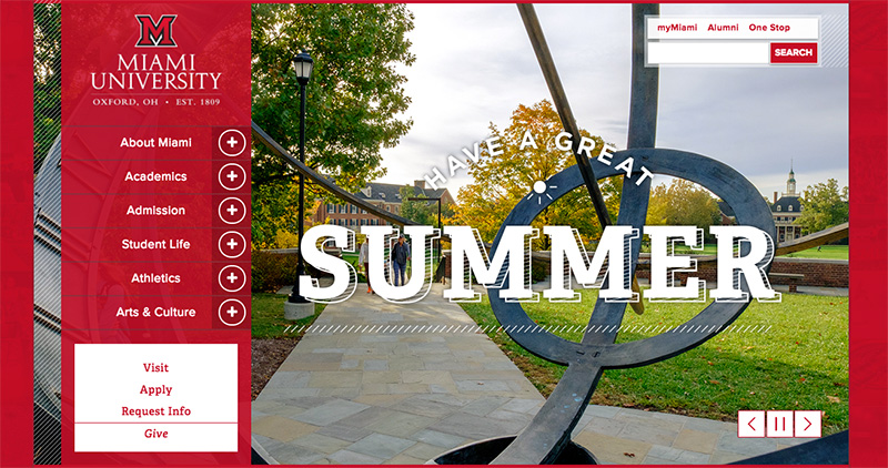
Flash forward to 2017, the age of Instagram, Facebook Live, and a world dominated by imagery and video. As Miami’s class of 2017 graduates, the design also graduates to a new, bolder look with enhanced, larger graphics intended to showcase Miami through photography, and more built-in accessibility features to accommodate all visitors.
The 2017 update includes: (www.miamioh.edu)
- A larger visual banner, friendly to mobile applications, that puts stories front and center.
- Cleaner, simpler navigation.
- More dominant use of the vibrant photography Miami is known for.
- Stronger social media integration to more actively connect with visitors.
- More focus on academics with a high-level snapshot of the academic offerings at Miami.
- Easier access to news and events to reflect topics that impact Miamians and visitors to Miami.
“We want to engage visitors while getting them quickly to where they want to go. And, although the primary audience remains prospective students, the new format also lets us tell faculty and staff stories in a more compelling way and capture the breadth of our teaching, research and engagement, visually linking all aspects of this incredible institution,” said Jessica Rea, university web design manager.
Accessibility components are critical, Rea explained, because they benefit all visitors, and Miami’s design builds them into the structure.
- Larger fonts and white backgrounds that make text more legible.
- Colors that clearly identify hyperlinks and visited links.
- Descriptive headings that identify content and bring order to the page.
- Content that can be navigated using only the keyboard.
More of today’s visitors to the home page use mobile technology and social media to learn about Miami. Miami was an early adopter of responsive design that ensures the website opens seamlessly and is easy to view on small devices. Miami chose not to build a separate mobile site/app.
Eventually, the new look will be incorporated into other top-tier pages, including academic divisional pages, but for now complements those pages so that the visitor clearly sees a connection in themes. Enrollment Management Services and Information Technology Services have rolled into the new look.
History of the Miami Homepage
Click the images below to view larger photos.
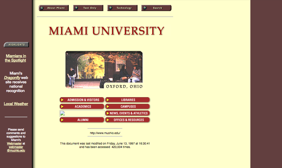
2001
2002

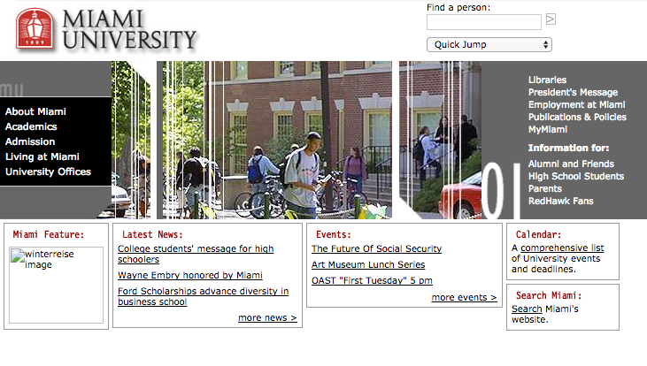
2004

2009
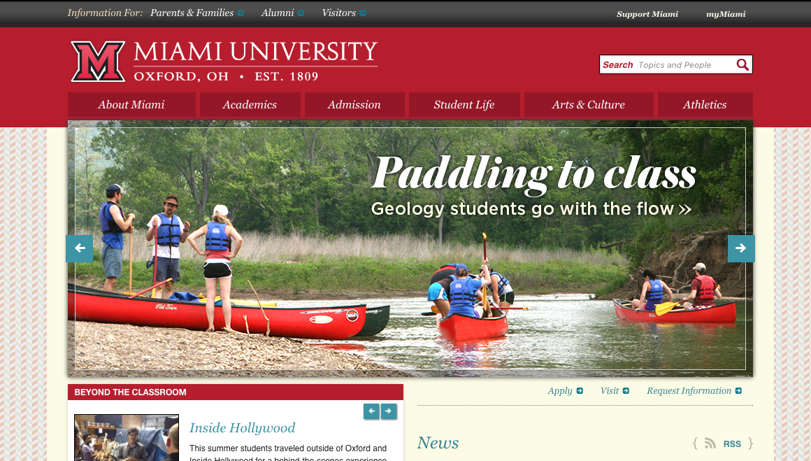
2012

2014